On point branding for
CUTTING THROUGH
THE NOISE
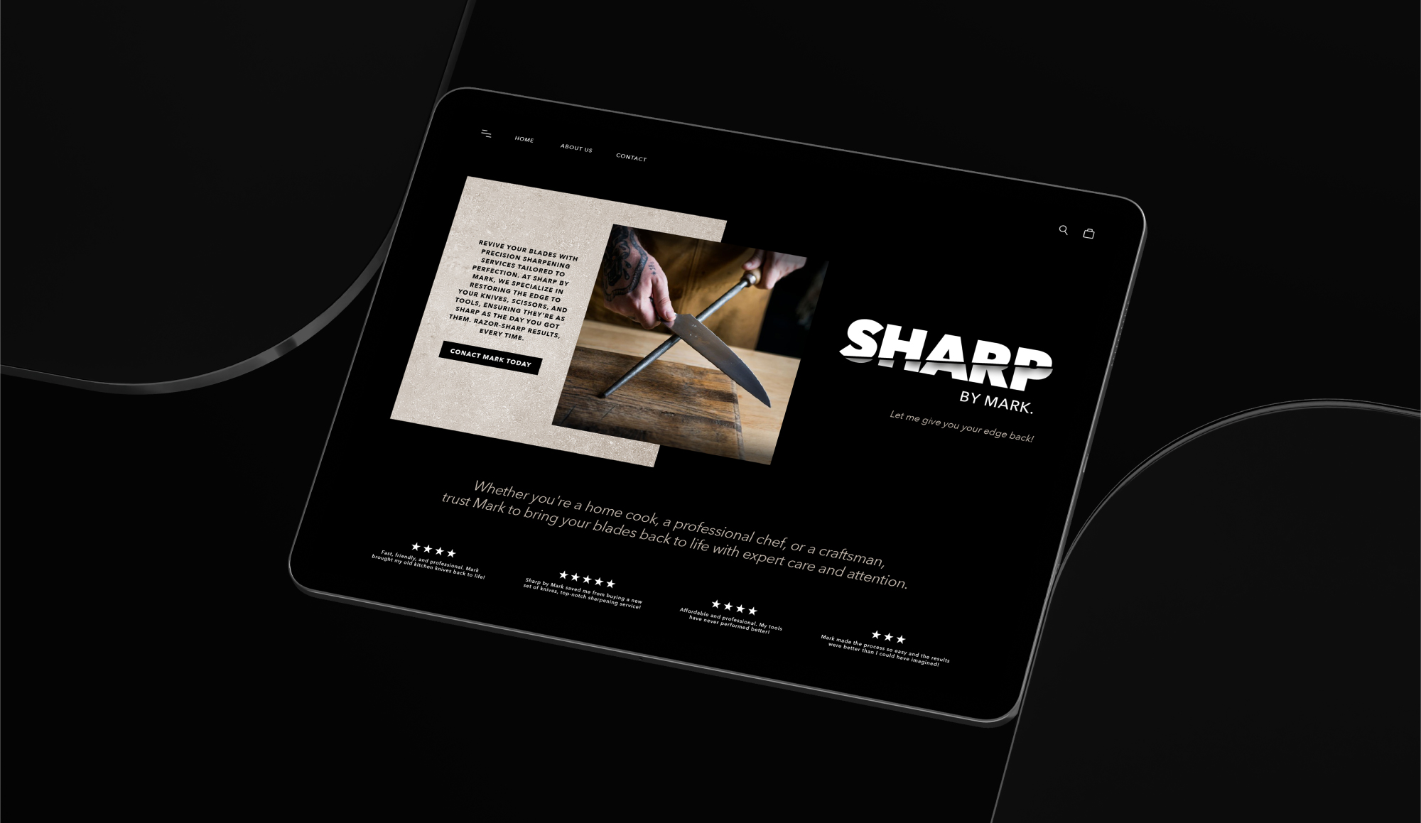
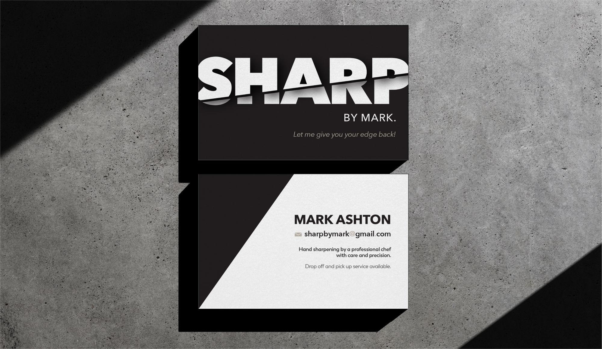
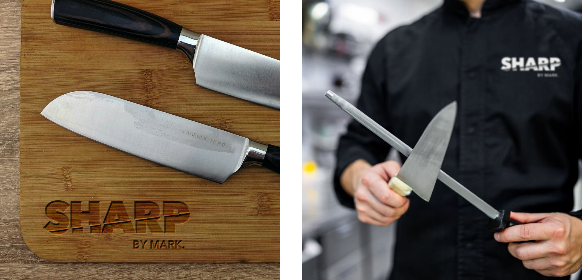
When we were approached by Mark Ashton to design a logo and business card for his new business, we knew we could make the cut.
Mark is the Head Chef at Lake Breeze, one of 80 wineries operating in the South Okanagan valley, Canada. He saw an opportunity for a sideline to his seasonal work, sharpening steels and blades, in order to benefit his fellow chefs in the Okanagan area.
WHAT WE DID
Branding
Design
Print Materials
PRESICION CRAFTED
DESIGN
We crafted a bold, blocky logo with a sharp, angular typeface, purposefully designed to echo the precision and strength of a knife. The font’s edgy lines, and slashes through the wordmark reflect the sharpness of the tools Mark specialises in.
To ensure maximum impact and a sleek, professional appearance, we chose a striking monochrome colour palette that allows the logo to cut through the noise and stand out with authority.